For our last map series, we chose the challenge of “mapping” various aspects of globalization. Taking the definition “globalization as time compression: reducing the friction of distance, restructuring, integrating and deepening interactions” as our point of inspiration, we hope that our map series highlights this geospatial complexity. Given time and software constraints- these were the maps we were able to create-
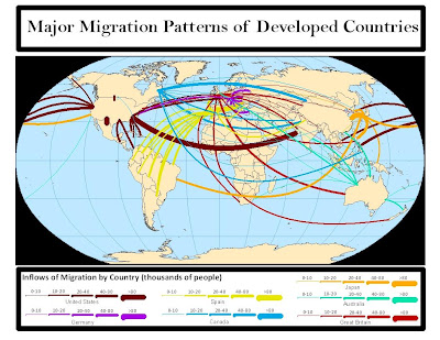
1. The first map highlights immigration from the top 7 developed countries. The tangled appearance shows the intricacies of population flows across the globe, and with what cultural and social consequences...
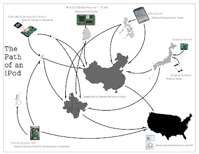
2. The second map took apart the path that a 30gig iPod takes as it is created. Many companies are responsible for various parts and several have varying locations for factories so that two iPods of the same make might have very different supply chains. Hopefully this highlights the globalization inherent in the objects we use everyday.
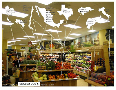
3. The third map looks at the countries (and state- Texas) that were geocoded in the produce section of the local Trader Joe’s. This map reveals the long distances our “fresh”produce must make to reach our homes.
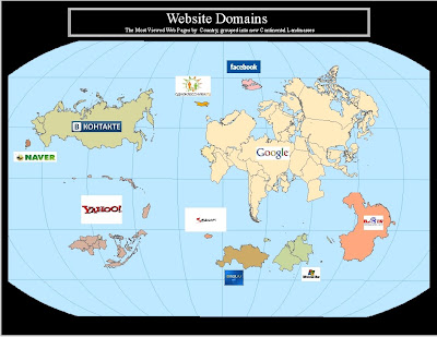
4. The fourth map takes data on internet usage by country around the world. Rather than making a traditional choropleth or symbolization map, we thought it might be fun to break up the countries into new continental land masses based on their top web page usage. Thus we see, the dominance of certain sites (Google) and the relationship between countries based on this commonality.
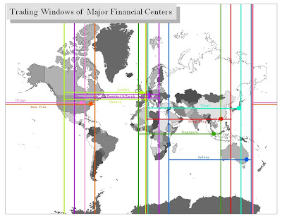
5. Another map looks at the windows in which global financial centers have time to trade. The global dispersion and tangling of money across the globe is a difficult thing to map but this map hopefully reminds us how trading is still tied to time and geography.
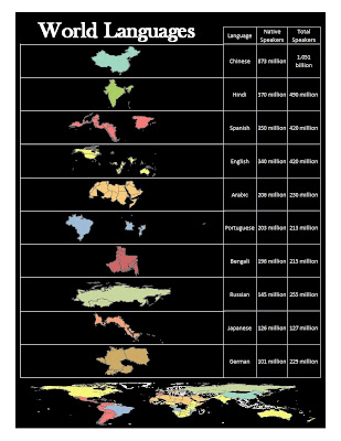
6. The sixth map looks at where the top 10 languages in the world are spoken and how many speakers there are. It shows how different areas of the world are interconnected and where there are links that tie countries together. Grouping the countries in this way emphasizes how languages are sometimes a regional (such as Russian or Arabic) and sometimes a global (such as English or Spanish) phenomenon.
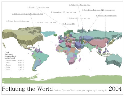
7. The last maps looks at the amount of carbon dioxide released by countries around the world on a per capita basis. This is meant to show that global warming is a world problem but that certain parts of the world contribute more to it than others.
